INTRODUCTION
It is common practice among all OECD and EU nations that household income is an indicator or proxy measure of material wellbeing. Income, however is not the only economic resource available to a household to generate its consumption possibilities. A household’s wealth (or lack of it) is another crucial factor. A household’s wealth is its total financial and non-financial assets less liabilities – this is sometimes called net worth. Income and net worth together largely determine the economic resources available to households to support their consumption of goods and services and therefore their material standard of living.
There is undeniable empirical evidence of increasing global and national inequality. The share of the pie for the poor has substantially declined over the last 30 years. As of 2014, the top 1% of income accounts for 10% of the total income in advanced economies (Piketty, 2014). In the United States the top 10% has an income of close to nine times that of the bottom 10%.
Inequality is more dramatic when the wealth of the rich and poor are compared. Wealth is defined as the net worth of assets in the form of property and real assets less liabilities. In 2017, the richest top 1% of the world population owned 50% of global wealth (Credit Suisse, 2018). Economic growth has improved standards of living, but has also resulted in greater inequality. On ethical grounds, material consumption per-capita should be shared equally between nations and within nations. Higher standards of living tend to be accompanied by lower total fertility. If the rich nations were to assist the poor nations to raise their standard of living, then the world population would grow more slowly on its path to Zero Population Growth
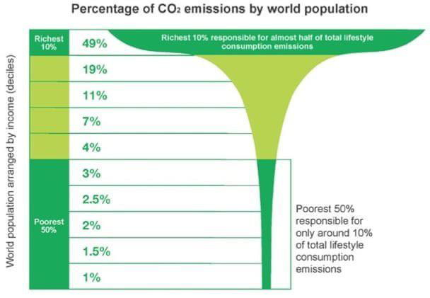
The mushroom graphic in Figure 1 shows the disproportionate consumption by the wealthy. In 2015, the richest 10% of people in the world, and that includes New Zealanders, were responsible for 49% of CO2 emissions, while the poorest 50% of people in the world were responsible for only around 10% of total lifestyle consumption emissions. An immediate 50% reduction in emissions by the richest 10% in the world would have reduced global CO2 emissions to 75% of levels in 2015. A 75% reduction would have reduced global emissions to 62.5% of levels in 2015.

In 2019, the top 10% by income group in the United States emitted almost 8 times as much tonnes of CO2e per capita than the bottom 50%.
Social inequalities within countries in previous years were, on average, lower across the globe than they are today.
Figure 1: Disproportionate Consumption by the Wealthy (Oxfam 2015)
The richest 10% of people in the world in 2015 were responsible for 49% of CO2 emissions while the poorest 50% of people in the world were responsible for only around 10%.
Close to 50% of all emissions in 2019 were created by just 10% of the global population.
Figure 2: Average carbon emissions across the world in 2019 (Chancel 2021)
The world average CO2e emissions in 2019 was 6.6 tonnes per capita compared to the average of 20.8 tonnes per capita in North America.
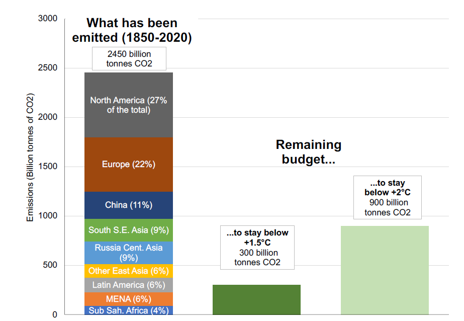
Figure 3: Historical emissions versus remaining carbon budget (Chancel 2021)
North America and Europe combined were responsible for almost 50% of all historical greenhouse gas compared to 11% for China.
If historical responsibilities were taken into account, then many high-income nations would have no carbon budget left.
INEQUALITIES IN CONSUMPTION AND GREENHOUSE GAS EMISSIONS BETWEEN COUNTRIES
The extent of Inequalities in consumption and emissions of greenhouse gas equivalents (CO2e) between countries is shown in Figure 2 below.
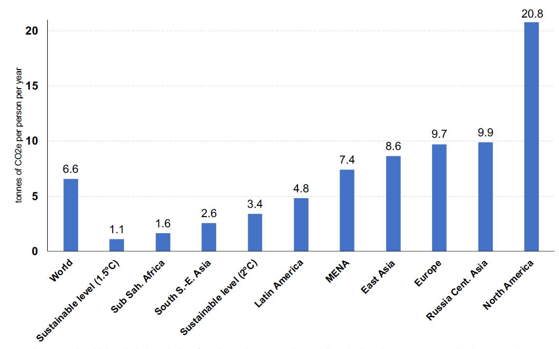
According to Chancel (2021), the annual sustainable budget compatible with the 1.5°C limit is 1.1 tonne of CO2e per capita. This value is about six times less than the current global average. The annual sustainable budget compatible with the +2°C temperature limit is 3.4 tonnes per capita.
Figure 3 shows historical emissions from 1850 t0 2020 for different global regions.
INEQUALITY BETWEEN INDIVIDUALS AT THE WORLD LEVEL
Figure 4 shows the inequality of carbon emissions between individuals at the world level.
Figure 4: Average per capita emissions by group in 2019 (Chancel 2021)
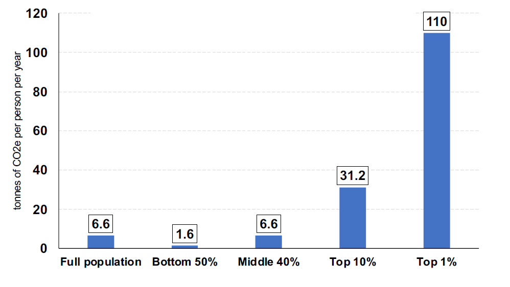
In 2019, the global bottom 50% emitted on average 1.6 tonnes per capita and contributed 12% of the total emissions. The middle 40% emitted 6.6 tonnes on average, making up 40.4% of the total emissions. The top 10% emitted 31 tonnes (47.6% of the total emissions) and the top 1% emitted 110 tonnes (16.8% of the total emissions).
INEQUALITY OF CONSUMPTION AND GREENHOUSE EMISSIONS WITHIN NATIONS
Inequality also exists within nations. Figure 5 shows per capita emissions by income group in the United States as an example.
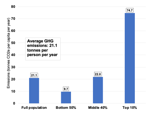
Figure 5: Emissions inequality and per capita emissions in the US 2019 (Chancel 2021)
The Gini index measures the extent to which the distribution of income or consumption expenditure among individuals or households within an economy deviates from a perfectly equal distribution. A Gini index of 0 represents perfect equality, while an index of 100 implies perfect inequality. Figure 6 shows the increase in household inequality in New Zealand from 1982 to 2016 using the Gini index.
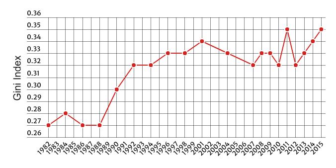
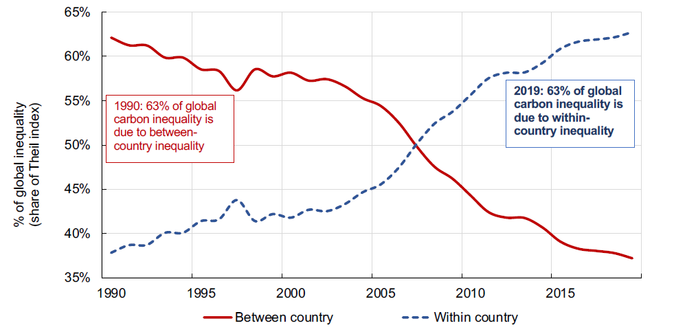
Figure 6: Gini index measure of household inequality in New Zealand 1982-2015 (Stats NZ)
Figure 7: Global carbon inequality between countries and within countries 1990 to 2019 (Chancel 2021)
The vertical Y-axis show the percentage of global inequality using the Theil index which is used to measure economic inequality. The Theil index measures a distance away from the ideal egalitarian state of everyone having the same income. Greater levels of inequality are indicated by higher percentages of the Theil index. In 1990, most global carbon inequality (63%) was due to differences between countries.
Global carbon inequalities are mainly due to inequality within countries.
Domestic emissions inequalities now account for nearly two thirds of global emissions inequality.
Inequality between countries still exists, but there are now even greater inequalities within countries which have serious ramifications if we are to have any success in mitigating the impact of climate change.
Carbon emission pledges made at the 2015 Paris Agreement are typically expressed in aggregate emissions percentage reductions from a base year. These pledges can be expressed in terms of emissions per capita at a certain time to make better sense of what they imply. These targets do not represent what must be done in order to keep emissions below 1.5 or 2°C. Official commitments do not add up to meeting the 2°C objective, much less to meeting the 1.5°C target.
All actions to reduce our greenhouse gas emissions involve reductions in
consumption. Those on low incomes have less ability to further reduce their carbon footprints than those on higher incomes.
The United States pledge amounts to a 53% reduction by 2030 of its 2019 per capita emissions. This equates to an average target emission of 3.0 tonnes of CO2e per capita by 2030.
Figure 8 shows an example of necessary reductions in consumption and emissions of CO2e by income group to stay within this target.

Figure 8: Emissions by group versus a 3.0 tonne CO2e per capita climate target by 2030 in the US (Chancel 2021)
The bottom half of the population in the United States is already 3% below the target.
The middle 40% and top 10% would need to reduce the CO2e emissions by 54% and 87% respectively to achieve the target of 3.0 tonnes of CO2e emissions by 2030.
The bottom 50% of other rich countries are already below a 2030 target of 3.0 tonnes of CO2e per capita, or close to it.
REFERENCES
Chancel, L. (2021), Climate Change & the Global Inequality of Carbon Emissions, 1990-2020, Summary, World Inequality Lab, Paris School of Economics, pp1-37. https://wid.world/news-article/climate-change-the-global-inequality-of-carbon-emissions/
Credit Suisse (2018) Global Wealth Report 2018. 60pp. https://www.credit-suisse.com/media/assets/corporate/docs/about-us/research/publications/global-wealth-report-2018-en.pdf
MBIE (2023) Energy Hardship Expert Panel and Reference Group. https://www.mbie.govt.nz/building-and-energy/energy-and-natural-resources/energy-hardship/energy-hardship-expert-panel-and-reference-group/
MSD (2019) Household incomes in New Zealand: Trends in indicators of inequality and hardship 1982 to 2018. https://www.msd.govt.nz/about-msd-and-our-work/publications-resources/monitoring/household-incomes/household-incomes-1982-to-2018.html
Oxfam in The Guardian 2 December 2015 https://www.theguardian.com/environment/2015/dec/02/worlds-richest-10-produce-half-of-global-carbon-emissions-says-oxfam
Piketty, T. (2014) Capital in the Twenty-First Century. The Belknap Press of Harvard University Press. 452 pp.
Stats NZ Website https://www.stats.govt.nz
Stiglitz, J. (2012) The Price of Inequality: How Today’s Divided Society Endangers Our Future. New York, W.W. Norton Company.
Wilkinson, R. and Pickett, K. (2009) The Spirit Level: Why Greater Equality Makes Society Stronger. New York, Bloomsbury Press, 374 pp.
People accumulate wealth over the course of their lives. Many older people have relatively high wealth (often in the form of a mortgage-free home in the main) but low income. Many younger households have lower wealth but higher incomes than many older people. Some of all ages have low incomes and low wealth levels.
Figure 7 shows global carbon inequality between countries and within countries from 1990 to 2019.
Energy poverty, an inadequate access to energy, is primarily due to an inadequate income distribution. Energy poverty applies especially to those on sickness and unemployment benefits, those on minimum wages, and superannuitants whose sole income is their pensions. Energy poverty is compounded when those on low incomes pay market rents or when families have more than two children. Those on higher incomes in New Zealand have greater claims on resources (they have an effective demand as opposed to a need), consume more goods and services, and currently emit higher levels of greenhouse gases to the atmosphere than those on low incomes. Those on higher incomes are also more easily able to absorb future increases in the costs of goods and services whereas those on low incomes cannot.
In a future where we will need to learn how to live well on less energy per capita, many more households than current households will face energy poverty for all forms of essential goods and services if current inequalities in claims on goods and services are not fully addressed. Wilkinson and Pickett (2009) set out a strong argument why greater equality makes society stronger and Stiglitz (2012) describes how inequality divides society and endangers our future. Inequality in income and claims on current and future resources required to achieve an acceptable standard of living can be reduced by greater progressive tax on income and limits on income. Rationing of some goods and services and removing barriers to access of essentials in the form of free government coupons might be necessary to ensure that everyone in New Zealand has an acceptable standard of living. An adequate Universal Basic Income is another approach.